

HOW WE WORK
2008 — PRESENT


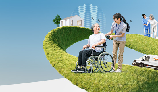
Exploring new boundaries in IDENTITY, our work on DAYCARE 113 integrates innovative design principles. The visual language was carefully curated to reflect both elegance and dynamic energy.
The ZEPHYRCYCLE project is a prime example of our dedication to high-quality BRANDING. By blending creative vision with technical precision, we delivered a solution that stands out in its field.

The DAYCAREPROFESSIONAL CARE project is a prime example of our dedication to high-quality KEY VISUAL. By blending creative vision with technical precision, we delivered a solution that stands out in its field.

This project, KAO LIANG2021-2023, showcases our comprehensive approach to PACKAGE. We focused on highlighting the core brand values through impactful visual storytelling and precise execution, ensuring a seamless user experience.
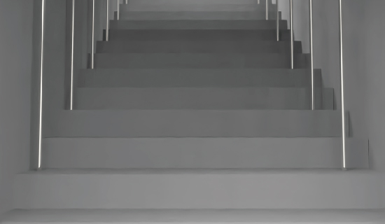
For STAIRCASE VISION, we developed a bespoke spatiac strategy that elevates the brand's presence. Every detail in this project was crafted to resonate with the target audience while maintaining a clean, modern aesthetic.

With FACIAL CLEANSER, our goal was to redefine what PACKAGE could look like. The resulting design emphasizes clarity, engaging visuals, and a strong foundational narrative that drives impact.
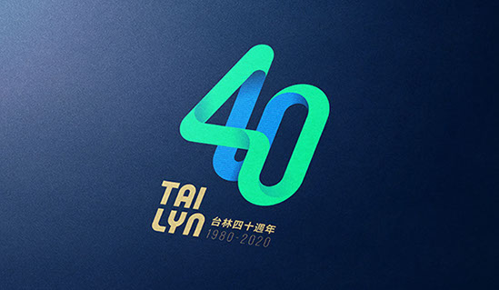
This project, TAILYN 40TH, showcases our comprehensive approach to KEY VISUAL. We focused on highlighting the core brand values through impactful visual storytelling and precise execution, ensuring a seamless user experience.
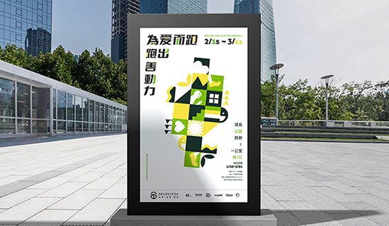
The BH LIFE STYLE project is a prime example of our dedication to high-quality KEY VISUAL. By blending creative vision with technical precision, we delivered a solution that stands out in its field.

With PROSPERITY, our goal was to redefine what IDENTITY could look like. The resulting design emphasizes clarity, engaging visuals, and a strong foundational narrative that drives impact.
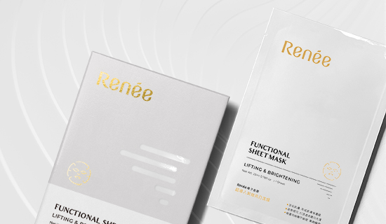
For RENEE, we developed a bespoke PACKAGE strategy that elevates the brand's presence. Every detail in this project was crafted to resonate with the target audience while maintaining a clean, modern aesthetic.
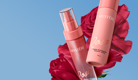
Exploring new boundaries in PACKAGE, our work on ROSES AND THORNS integrates innovative design principles. The visual language was carefully curated to reflect both elegance and dynamic energy.
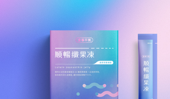
The SMOOTH JELLY project is a prime example of our dedication to high-quality PACKAGE. By blending creative vision with technical precision, we delivered a solution that stands out in its field.
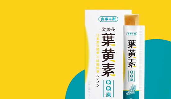
Exploring new boundaries in PACKAGE, our work on LUTEIN JELLY integrates innovative design principles. The visual language was carefully curated to reflect both elegance and dynamic energy.
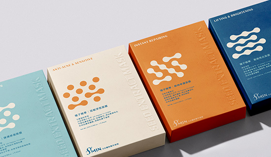
This project, SHEET MASK, showcases our comprehensive approach to PACKAGE. We focused on highlighting the core brand values through impactful visual storytelling and precise execution, ensuring a seamless user experience.
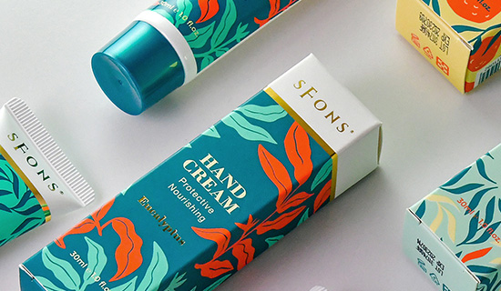
The HAND CREAM project is a prime example of our dedication to high-quality PACKAGE. By blending creative vision with technical precision, we delivered a solution that stands out in its field.
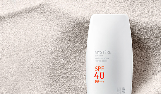
For SUNSCREEN, we developed a bespoke PACKAGE strategy that elevates the brand's presence. Every detail in this project was crafted to resonate with the target audience while maintaining a clean, modern aesthetic.
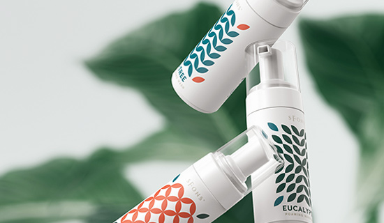
Exploring new boundaries in PACKAGE, our work on FOAM WASH integrates innovative design principles. The visual language was carefully curated to reflect both elegance and dynamic energy.
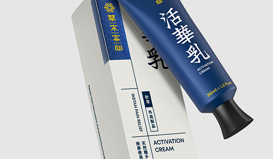
Exploring new boundaries in IDENTITY, our work on BOTANIC HEART integrates innovative design principles. The visual language was carefully curated to reflect both elegance and dynamic energy.
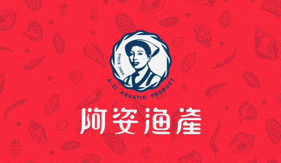
This project, A-ZI, showcases our comprehensive approach to IDENTITY. We focused on highlighting the core brand values through impactful visual storytelling and precise execution, ensuring a seamless user experience.
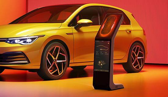
The KIOSK III project is a prime example of our dedication to high-quality INDUSTRIAL. By blending creative vision with technical precision, we delivered a solution that stands out in its field.
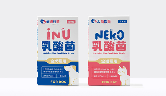
The PET PLOY project is a prime example of our dedication to high-quality PACKAGE. By blending creative vision with technical precision, we delivered a solution that stands out in its field.
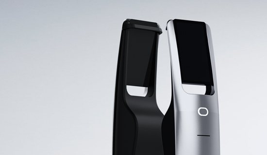
With KIOSK II, our goal was to redefine what INDUSTRIAL could look like. The resulting design emphasizes clarity, engaging visuals, and a strong foundational narrative that drives impact.
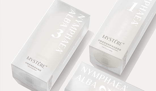
Exploring new boundaries in PACKAGE, our work on MYSTERE integrates innovative design principles. The visual language was carefully curated to reflect both elegance and dynamic energy.
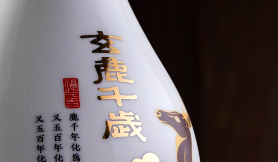
The KAOLIANG 2019 project is a prime example of our dedication to high-quality PACKAGE. By blending creative vision with technical precision, we delivered a solution that stands out in its field.
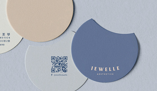
Exploring new boundaries in IDENTITY, our work on JEWELLE 2019 integrates innovative design principles. The visual language was carefully curated to reflect both elegance and dynamic energy.
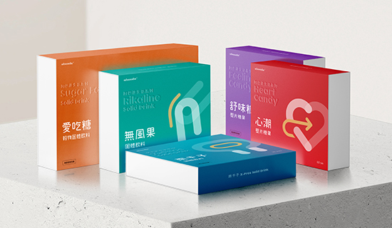
This project, ABAADA, showcases our comprehensive approach to PACKAGE. We focused on highlighting the core brand values through impactful visual storytelling and precise execution, ensuring a seamless user experience.
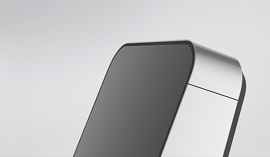
Exploring new boundaries in INDUSTRIAL, our work on FACE RECOGNITION integrates innovative design principles. The visual language was carefully curated to reflect both elegance and dynamic energy.
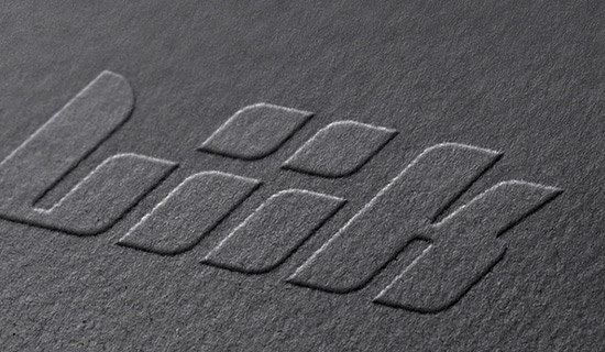
This project, LIIK VAPE, showcases our comprehensive approach to INDUSTRIAL. We focused on highlighting the core brand values through impactful visual storytelling and precise execution, ensuring a seamless user experience.
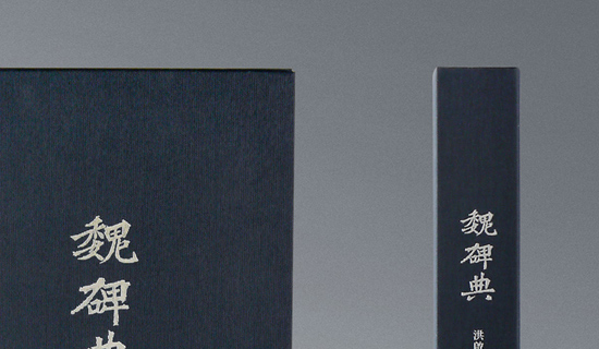
For WEI BEI, we developed a bespoke BOOK DESIGN strategy that elevates the brand's presence. Every detail in this project was crafted to resonate with the target audience while maintaining a clean, modern aesthetic.
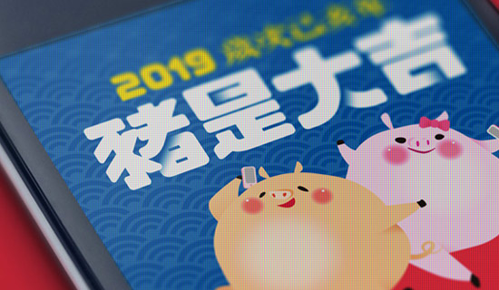
Exploring new boundaries in illustration, our work on PIG YEAR integrates innovative design principles. The visual language was carefully curated to reflect both elegance and dynamic energy.
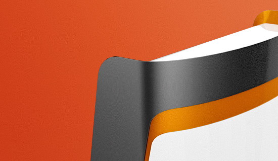
For THSR KIOSK, we developed a bespoke INDUSTRIAL strategy that elevates the brand's presence. Every detail in this project was crafted to resonate with the target audience while maintaining a clean, modern aesthetic.
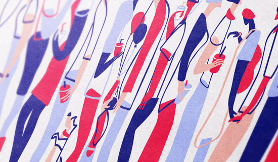
Exploring new boundaries in illustration, our work on CROWD integrates innovative design principles. The visual language was carefully curated to reflect both elegance and dynamic energy.
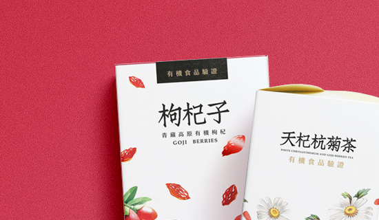
For GOJI, we developed a bespoke PACKAGING strategy that elevates the brand's presence. Every detail in this project was crafted to resonate with the target audience while maintaining a clean, modern aesthetic.
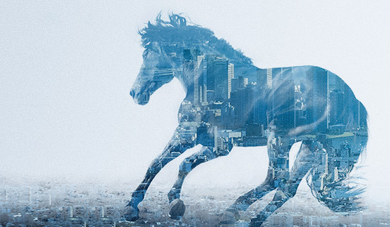
This project, XANTHUS, showcases our comprehensive approach to IDENTITY. We focused on highlighting the core brand values through impactful visual storytelling and precise execution, ensuring a seamless user experience.

This project, KAO LIANG 2018, showcases our comprehensive approach to PACKAGE. We focused on highlighting the core brand values through impactful visual storytelling and precise execution, ensuring a seamless user experience.
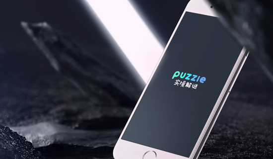
This project, PUZZIE, showcases our comprehensive approach to IDENTITY. We focused on highlighting the core brand values through impactful visual storytelling and precise execution, ensuring a seamless user experience.
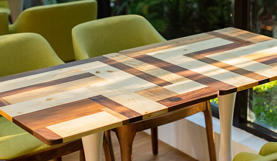
Exploring new boundaries in BRANDING, our work on 109 CAFE integrates innovative design principles. The visual language was carefully curated to reflect both elegance and dynamic energy.
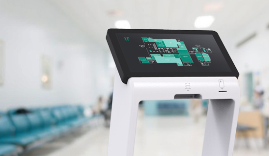
For ICARE, we developed a bespoke INDUSTRIAL strategy that elevates the brand's presence. Every detail in this project was crafted to resonate with the target audience while maintaining a clean, modern aesthetic.
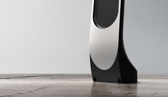
For KIOSK, we developed a bespoke INDUSTRIAL strategy that elevates the brand's presence. Every detail in this project was crafted to resonate with the target audience while maintaining a clean, modern aesthetic.

With WONDERSUN, our goal was to redefine what EXHIBITION could look like. The resulting design emphasizes clarity, engaging visuals, and a strong foundational narrative that drives impact.
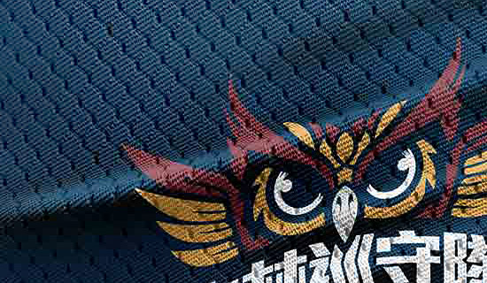
With FOREST RANGER, our goal was to redefine what IDENTITY could look like. The resulting design emphasizes clarity, engaging visuals, and a strong foundational narrative that drives impact.
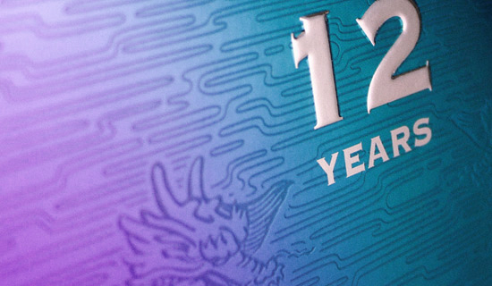
The KINMEN KAOLIANG project is a prime example of our dedication to high-quality PACKAGING. By blending creative vision with technical precision, we delivered a solution that stands out in its field.
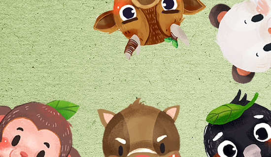
With MASCOT, our goal was to redefine what CLOTHING could look like. The resulting design emphasizes clarity, engaging visuals, and a strong foundational narrative that drives impact.
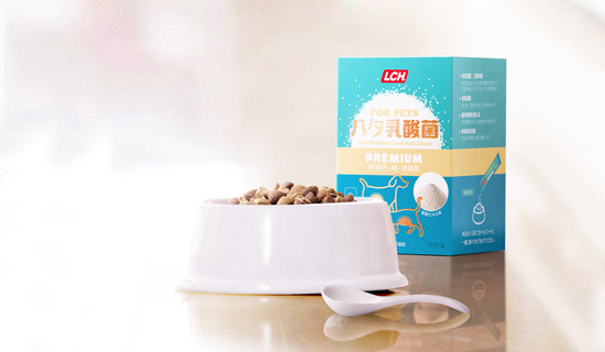
For PETS 2017, we developed a bespoke PACKAGING strategy that elevates the brand's presence. Every detail in this project was crafted to resonate with the target audience while maintaining a clean, modern aesthetic.

With WELLDIET, our goal was to redefine what BRANDING could look like. The resulting design emphasizes clarity, engaging visuals, and a strong foundational narrative that drives impact.
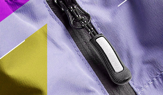
Exploring new boundaries in EXHIBITION, our work on UFA 2017 integrates innovative design principles. The visual language was carefully curated to reflect both elegance and dynamic energy.
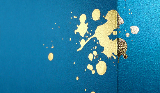
For KAO LIANG 2017, we developed a bespoke PACKAGE strategy that elevates the brand's presence. Every detail in this project was crafted to resonate with the target audience while maintaining a clean, modern aesthetic.

Exploring new boundaries in BRANDING, our work on CRANBERRY integrates innovative design principles. The visual language was carefully curated to reflect both elegance and dynamic energy.

The LCH 2017 project is a prime example of our dedication to high-quality photography. By blending creative vision with technical precision, we delivered a solution that stands out in its field.
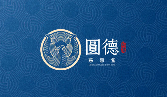
For CI HUI TANG, we developed a bespoke IDENTITY strategy that elevates the brand's presence. Every detail in this project was crafted to resonate with the target audience while maintaining a clean, modern aesthetic.

With TAIWAN CENTER 2017, our goal was to redefine what IDENTITY could look like. The resulting design emphasizes clarity, engaging visuals, and a strong foundational narrative that drives impact.
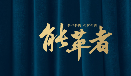
The SAVE KMT project is a prime example of our dedication to high-quality GRAPHIC. By blending creative vision with technical precision, we delivered a solution that stands out in its field.
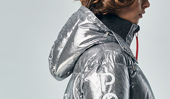
Exploring new boundaries in IDENTITY, our work on LEADER FASHION 2017 integrates innovative design principles. The visual language was carefully curated to reflect both elegance and dynamic energy.
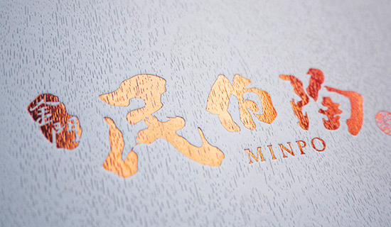
With MINPO, our goal was to redefine what photography could look like. The resulting design emphasizes clarity, engaging visuals, and a strong foundational narrative that drives impact.
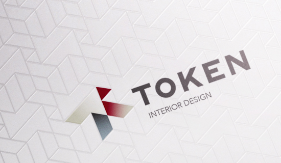
The TOKEN project is a prime example of our dedication to high-quality IDENTITY. By blending creative vision with technical precision, we delivered a solution that stands out in its field.
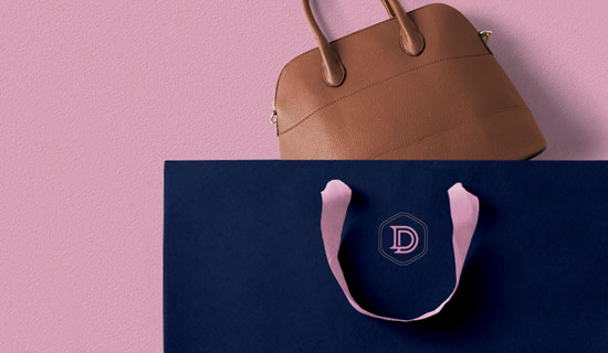
This project, DI DONNA, showcases our comprehensive approach to IDENTITY. We focused on highlighting the core brand values through impactful visual storytelling and precise execution, ensuring a seamless user experience.
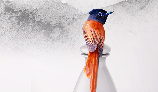
For KAO LIANG 2016, we developed a bespoke PACKAGE strategy that elevates the brand's presence. Every detail in this project was crafted to resonate with the target audience while maintaining a clean, modern aesthetic.

This project, DONG TING, showcases our comprehensive approach to IDENTITY. We focused on highlighting the core brand values through impactful visual storytelling and precise execution, ensuring a seamless user experience.
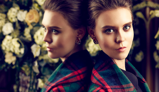
Exploring new boundaries in photography, our work on IMICKOO FALL integrates innovative design principles. The visual language was carefully curated to reflect both elegance and dynamic energy.

The LOHAS project is a prime example of our dedication to high-quality BRANDING. By blending creative vision with technical precision, we delivered a solution that stands out in its field.
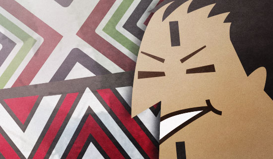
The Indigenous project is a prime example of our dedication to high-quality illustration. By blending creative vision with technical precision, we delivered a solution that stands out in its field.
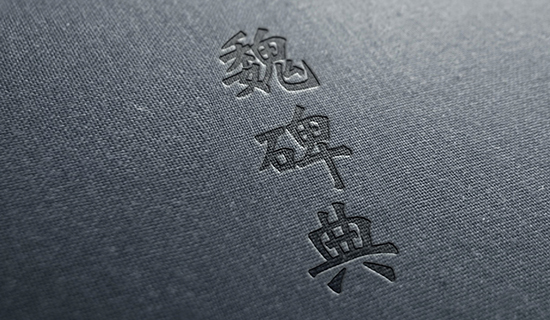
Exploring new boundaries in dictionary, our work on wei rubbings integrates innovative design principles. The visual language was carefully curated to reflect both elegance and dynamic energy.

The FOR SCHOOL project is a prime example of our dedication to high-quality Visual design. By blending creative vision with technical precision, we delivered a solution that stands out in its field.
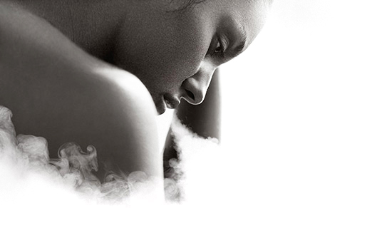
With ARKVAP, our goal was to redefine what BRANDING could look like. The resulting design emphasizes clarity, engaging visuals, and a strong foundational narrative that drives impact.

For LOHAS TREE, we developed a bespoke BRANDING strategy that elevates the brand's presence. Every detail in this project was crafted to resonate with the target audience while maintaining a clean, modern aesthetic.
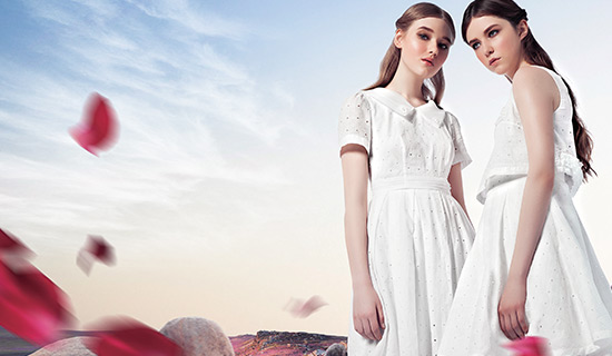
This project, IMICKOO S/S, showcases our comprehensive approach to photography. We focused on highlighting the core brand values through impactful visual storytelling and precise execution, ensuring a seamless user experience.

For DEEP WHITE, we developed a bespoke Furniture strategy that elevates the brand's presence. Every detail in this project was crafted to resonate with the target audience while maintaining a clean, modern aesthetic.

The ENZYME project is a prime example of our dedication to high-quality BRANDING. By blending creative vision with technical precision, we delivered a solution that stands out in its field.
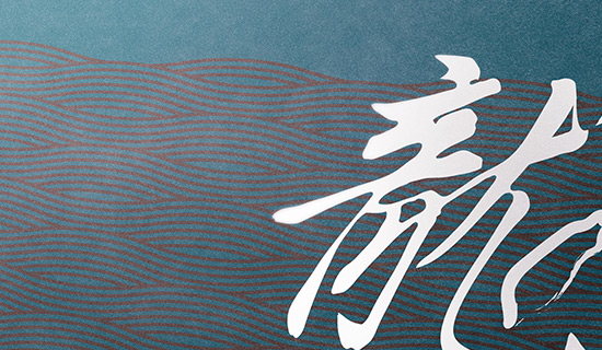
This project, TAIWAN CENTER, showcases our comprehensive approach to BRANDING. We focused on highlighting the core brand values through impactful visual storytelling and precise execution, ensuring a seamless user experience.

With FIEFDOM, our goal was to redefine what BRANDING could look like. The resulting design emphasizes clarity, engaging visuals, and a strong foundational narrative that drives impact.
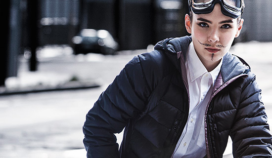
Exploring new boundaries in photography, our work on WO! MAN! integrates innovative design principles. The visual language was carefully curated to reflect both elegance and dynamic energy.

With brochure, our goal was to redefine what book design could look like. The resulting design emphasizes clarity, engaging visuals, and a strong foundational narrative that drives impact.

For RED CORAL, we developed a bespoke Graphic strategy that elevates the brand's presence. Every detail in this project was crafted to resonate with the target audience while maintaining a clean, modern aesthetic.

The FLOAT project is a prime example of our dedication to high-quality photography. By blending creative vision with technical precision, we delivered a solution that stands out in its field.
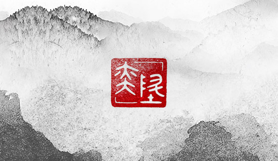
With E-SUN, our goal was to redefine what BRANDING could look like. The resulting design emphasizes clarity, engaging visuals, and a strong foundational narrative that drives impact.
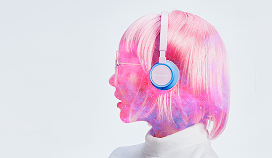
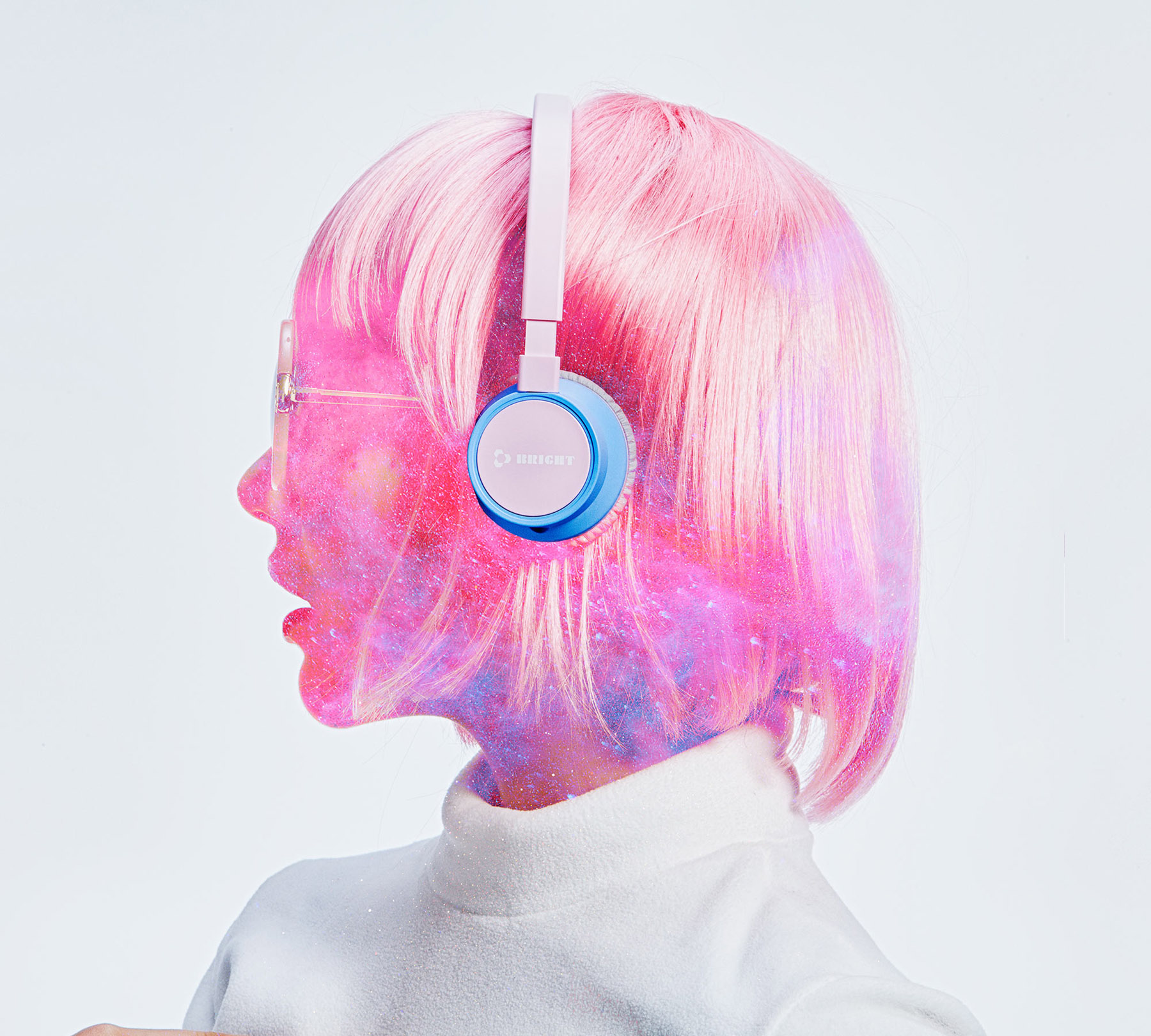
With headset, our goal was to redefine what photography could look like. The resulting design emphasizes clarity, engaging visuals, and a strong foundational narrative that drives impact.

For LCHCollagen, we developed a bespoke BRANDING strategy that elevates the brand's presence. Every detail in this project was crafted to resonate with the target audience while maintaining a clean, modern aesthetic.
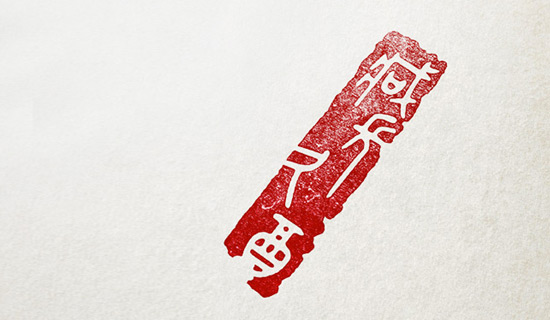
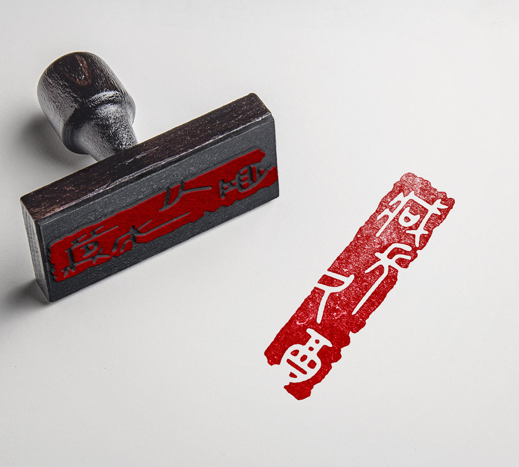
Exploring new boundaries in Graphic, our work on STAMP integrates innovative design principles. The visual language was carefully curated to reflect both elegance and dynamic energy.
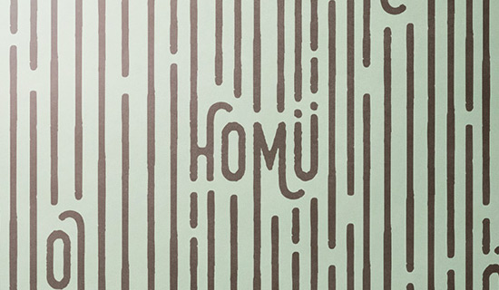
This project, HOMU, showcases our comprehensive approach to BRANDING. We focused on highlighting the core brand values through impactful visual storytelling and precise execution, ensuring a seamless user experience.
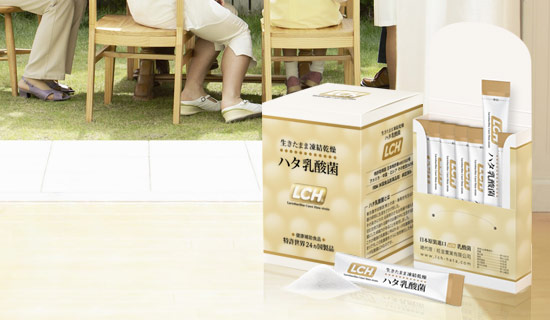
For LCH HATA, we developed a bespoke BRANDING strategy that elevates the brand's presence. Every detail in this project was crafted to resonate with the target audience while maintaining a clean, modern aesthetic.
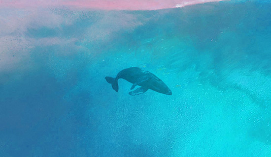
This project, SEA HEART, showcases our comprehensive approach to painting. We focused on highlighting the core brand values through impactful visual storytelling and precise execution, ensuring a seamless user experience.

Exploring new boundaries in Graphic, our work on DOT DOTS integrates innovative design principles. The visual language was carefully curated to reflect both elegance and dynamic energy.
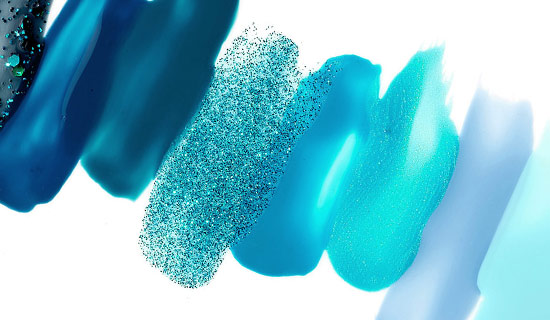
The JEWELLE project is a prime example of our dedication to high-quality BRANDING. By blending creative vision with technical precision, we delivered a solution that stands out in its field.

The FOUR STYLE project is a prime example of our dedication to high-quality photography. By blending creative vision with technical precision, we delivered a solution that stands out in its field.
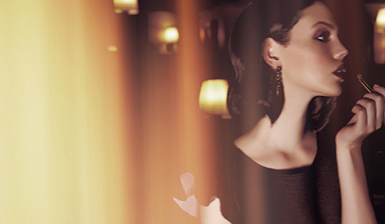
For IMICKOO F/W, we developed a bespoke photography strategy that elevates the brand's presence. Every detail in this project was crafted to resonate with the target audience while maintaining a clean, modern aesthetic.
Exploring new boundaries in BRANDING, our work on MOON integrates innovative design principles. The visual language was carefully curated to reflect both elegance and dynamic energy.

This project, CORUM YACHTS, showcases our comprehensive approach to BRANDING. We focused on highlighting the core brand values through impactful visual storytelling and precise execution, ensuring a seamless user experience.
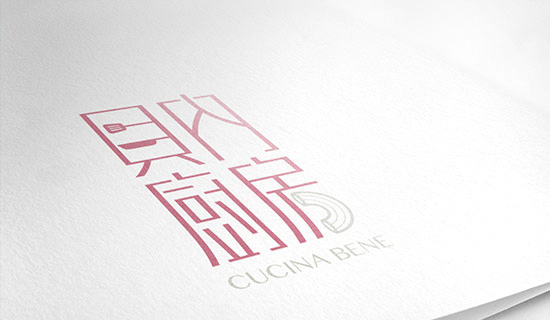
This project, CUCINA BENE, showcases our comprehensive approach to BRANDING. We focused on highlighting the core brand values through impactful visual storytelling and precise execution, ensuring a seamless user experience.
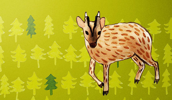
With NATURAL LIFE, our goal was to redefine what BOOK could look like. The resulting design emphasizes clarity, engaging visuals, and a strong foundational narrative that drives impact.
With UFA, our goal was to redefine what BRANDING could look like. The resulting design emphasizes clarity, engaging visuals, and a strong foundational narrative that drives impact.

Exploring new boundaries in EXHIBITION, our work on HAKKA MUSIC integrates innovative design principles. The visual language was carefully curated to reflect both elegance and dynamic energy.
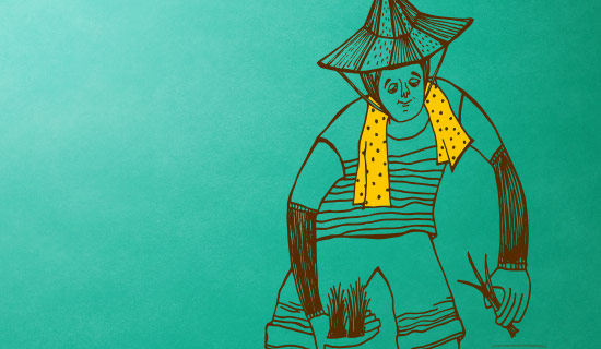
This project, GOOD EAT CAFE, showcases our comprehensive approach to BRANDING. We focused on highlighting the core brand values through impactful visual storytelling and precise execution, ensuring a seamless user experience.
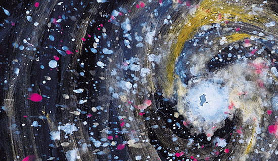
With THE DU COEUR, our goal was to redefine what PACKAGE could look like. The resulting design emphasizes clarity, engaging visuals, and a strong foundational narrative that drives impact.
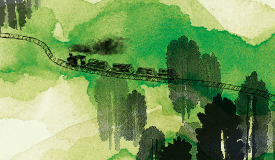
For PLANT GOOD LIFE, we developed a bespoke EXHIBITION strategy that elevates the brand's presence. Every detail in this project was crafted to resonate with the target audience while maintaining a clean, modern aesthetic.
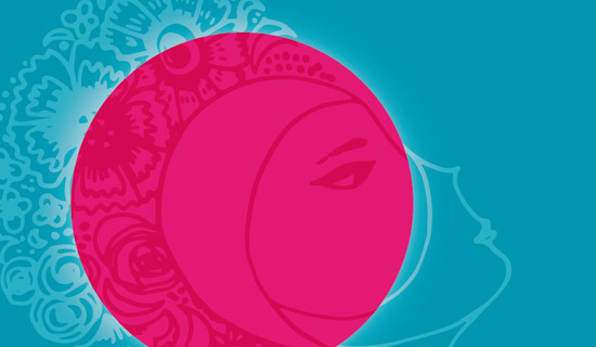
Exploring new boundaries in BRANDING, our work on NEW MOON integrates innovative design principles. The visual language was carefully curated to reflect both elegance and dynamic energy.

For SHENG HSIEN, we developed a bespoke BRANDING strategy that elevates the brand's presence. Every detail in this project was crafted to resonate with the target audience while maintaining a clean, modern aesthetic.
Exploring new boundaries in BRANDING, our work on NEW MOON integrates innovative design principles. The visual language was carefully curated to reflect both elegance and dynamic energy.
With THE DU COEUR, our goal was to redefine what PACKAGE could look like. The resulting design emphasizes clarity, engaging visuals, and a strong foundational narrative that drives impact.
Exploring new boundaries in EXHIBITION, our work on HAKKA MUSIC integrates innovative design principles. The visual language was carefully curated to reflect both elegance and dynamic energy.
With NATURAL LIFE, our goal was to redefine what BOOK could look like. The resulting design emphasizes clarity, engaging visuals, and a strong foundational narrative that drives impact.
This project, CORUM YACHTS, showcases our comprehensive approach to BRANDING. We focused on highlighting the core brand values through impactful visual storytelling and precise execution, ensuring a seamless user experience.
For IMICKOO F/W, we developed a bespoke photography strategy that elevates the brand's presence. Every detail in this project was crafted to resonate with the target audience while maintaining a clean, modern aesthetic.
The JEWELLE project is a prime example of our dedication to high-quality BRANDING. By blending creative vision with technical precision, we delivered a solution that stands out in its field.
This project, SEA HEART, showcases our comprehensive approach to painting. We focused on highlighting the core brand values through impactful visual storytelling and precise execution, ensuring a seamless user experience.
This project, HOMU, showcases our comprehensive approach to BRANDING. We focused on highlighting the core brand values through impactful visual storytelling and precise execution, ensuring a seamless user experience.
For LCHCollagen, we developed a bespoke BRANDING strategy that elevates the brand's presence. Every detail in this project was crafted to resonate with the target audience while maintaining a clean, modern aesthetic.
With E-SUN, our goal was to redefine what BRANDING could look like. The resulting design emphasizes clarity, engaging visuals, and a strong foundational narrative that drives impact.
For RED CORAL, we developed a bespoke Graphic strategy that elevates the brand's presence. Every detail in this project was crafted to resonate with the target audience while maintaining a clean, modern aesthetic.
Exploring new boundaries in photography, our work on WO! MAN! integrates innovative design principles. The visual language was carefully curated to reflect both elegance and dynamic energy.
This project, TAIWAN CENTER, showcases our comprehensive approach to BRANDING. We focused on highlighting the core brand values through impactful visual storytelling and precise execution, ensuring a seamless user experience.
For DEEP WHITE, we developed a bespoke Furniture strategy that elevates the brand's presence. Every detail in this project was crafted to resonate with the target audience while maintaining a clean, modern aesthetic.
For LOHAS TREE, we developed a bespoke BRANDING strategy that elevates the brand's presence. Every detail in this project was crafted to resonate with the target audience while maintaining a clean, modern aesthetic.
The FOR SCHOOL project is a prime example of our dedication to high-quality Visual design. By blending creative vision with technical precision, we delivered a solution that stands out in its field.
The Indigenous project is a prime example of our dedication to high-quality illustration. By blending creative vision with technical precision, we delivered a solution that stands out in its field.
Exploring new boundaries in photography, our work on IMICKOO FALL integrates innovative design principles. The visual language was carefully curated to reflect both elegance and dynamic energy.
For KAO LIANG 2016, we developed a bespoke PACKAGE strategy that elevates the brand's presence. Every detail in this project was crafted to resonate with the target audience while maintaining a clean, modern aesthetic.
The TOKEN project is a prime example of our dedication to high-quality IDENTITY. By blending creative vision with technical precision, we delivered a solution that stands out in its field.
Exploring new boundaries in IDENTITY, our work on LEADER FASHION 2017 integrates innovative design principles. The visual language was carefully curated to reflect both elegance and dynamic energy.
With TAIWAN CENTER 2017, our goal was to redefine what IDENTITY could look like. The resulting design emphasizes clarity, engaging visuals, and a strong foundational narrative that drives impact.
The LCH 2017 project is a prime example of our dedication to high-quality photography. By blending creative vision with technical precision, we delivered a solution that stands out in its field.
For KAO LIANG 2017, we developed a bespoke PACKAGE strategy that elevates the brand's presence. Every detail in this project was crafted to resonate with the target audience while maintaining a clean, modern aesthetic.
With WELLDIET, our goal was to redefine what BRANDING could look like. The resulting design emphasizes clarity, engaging visuals, and a strong foundational narrative that drives impact.
With MASCOT, our goal was to redefine what CLOTHING could look like. The resulting design emphasizes clarity, engaging visuals, and a strong foundational narrative that drives impact.
With FOREST RANGER, our goal was to redefine what IDENTITY could look like. The resulting design emphasizes clarity, engaging visuals, and a strong foundational narrative that drives impact.
For KIOSK, we developed a bespoke INDUSTRIAL strategy that elevates the brand's presence. Every detail in this project was crafted to resonate with the target audience while maintaining a clean, modern aesthetic.
Exploring new boundaries in BRANDING, our work on 109 CAFE integrates innovative design principles. The visual language was carefully curated to reflect both elegance and dynamic energy.
This project, KAO LIANG 2018, showcases our comprehensive approach to PACKAGE. We focused on highlighting the core brand values through impactful visual storytelling and precise execution, ensuring a seamless user experience.
For GOJI, we developed a bespoke PACKAGING strategy that elevates the brand's presence. Every detail in this project was crafted to resonate with the target audience while maintaining a clean, modern aesthetic.
For THSR KIOSK, we developed a bespoke INDUSTRIAL strategy that elevates the brand's presence. Every detail in this project was crafted to resonate with the target audience while maintaining a clean, modern aesthetic.
For WEI BEI, we developed a bespoke BOOK DESIGN strategy that elevates the brand's presence. Every detail in this project was crafted to resonate with the target audience while maintaining a clean, modern aesthetic.
Exploring new boundaries in INDUSTRIAL, our work on FACE RECOGNITION integrates innovative design principles. The visual language was carefully curated to reflect both elegance and dynamic energy.
Exploring new boundaries in IDENTITY, our work on JEWELLE 2019 integrates innovative design principles. The visual language was carefully curated to reflect both elegance and dynamic energy.
Exploring new boundaries in PACKAGE, our work on MYSTERE integrates innovative design principles. The visual language was carefully curated to reflect both elegance and dynamic energy.
The PET PLOY project is a prime example of our dedication to high-quality PACKAGE. By blending creative vision with technical precision, we delivered a solution that stands out in its field.
This project, A-ZI, showcases our comprehensive approach to IDENTITY. We focused on highlighting the core brand values through impactful visual storytelling and precise execution, ensuring a seamless user experience.
Exploring new boundaries in PACKAGE, our work on FOAM WASH integrates innovative design principles. The visual language was carefully curated to reflect both elegance and dynamic energy.
The HAND CREAM project is a prime example of our dedication to high-quality PACKAGE. By blending creative vision with technical precision, we delivered a solution that stands out in its field.
Exploring new boundaries in PACKAGE, our work on LUTEIN JELLY integrates innovative design principles. The visual language was carefully curated to reflect both elegance and dynamic energy.
Exploring new boundaries in PACKAGE, our work on ROSES AND THORNS integrates innovative design principles. The visual language was carefully curated to reflect both elegance and dynamic energy.
With PROSPERITY, our goal was to redefine what IDENTITY could look like. The resulting design emphasizes clarity, engaging visuals, and a strong foundational narrative that drives impact.
This project, TAILYN 40TH, showcases our comprehensive approach to KEY VISUAL. We focused on highlighting the core brand values through impactful visual storytelling and precise execution, ensuring a seamless user experience.
For STAIRCASE VISION, we developed a bespoke spatiac strategy that elevates the brand's presence. Every detail in this project was crafted to resonate with the target audience while maintaining a clean, modern aesthetic.
The DAYCAREPROFESSIONAL CARE project is a prime example of our dedication to high-quality KEY VISUAL. By blending creative vision with technical precision, we delivered a solution that stands out in its field.
Exploring new boundaries in IDENTITY, our work on DAYCARE 113 integrates innovative design principles. The visual language was carefully curated to reflect both elegance and dynamic energy.
The ZEPHYRCYCLE project is a prime example of our dedication to high-quality BRANDING. By blending creative vision with technical precision, we delivered a solution that stands out in its field.
This project, KAO LIANG2021-2023, showcases our comprehensive approach to PACKAGE. We focused on highlighting the core brand values through impactful visual storytelling and precise execution, ensuring a seamless user experience.
With FACIAL CLEANSER, our goal was to redefine what PACKAGE could look like. The resulting design emphasizes clarity, engaging visuals, and a strong foundational narrative that drives impact.
The BH LIFE STYLE project is a prime example of our dedication to high-quality KEY VISUAL. By blending creative vision with technical precision, we delivered a solution that stands out in its field.
For RENEE, we developed a bespoke PACKAGE strategy that elevates the brand's presence. Every detail in this project was crafted to resonate with the target audience while maintaining a clean, modern aesthetic.
The SMOOTH JELLY project is a prime example of our dedication to high-quality PACKAGE. By blending creative vision with technical precision, we delivered a solution that stands out in its field.
This project, SHEET MASK, showcases our comprehensive approach to PACKAGE. We focused on highlighting the core brand values through impactful visual storytelling and precise execution, ensuring a seamless user experience.
For SUNSCREEN, we developed a bespoke PACKAGE strategy that elevates the brand's presence. Every detail in this project was crafted to resonate with the target audience while maintaining a clean, modern aesthetic.
Exploring new boundaries in IDENTITY, our work on BOTANIC HEART integrates innovative design principles. The visual language was carefully curated to reflect both elegance and dynamic energy.
The KIOSK III project is a prime example of our dedication to high-quality INDUSTRIAL. By blending creative vision with technical precision, we delivered a solution that stands out in its field.
With KIOSK II, our goal was to redefine what INDUSTRIAL could look like. The resulting design emphasizes clarity, engaging visuals, and a strong foundational narrative that drives impact.
The KAOLIANG 2019 project is a prime example of our dedication to high-quality PACKAGE. By blending creative vision with technical precision, we delivered a solution that stands out in its field.
This project, ABAADA, showcases our comprehensive approach to PACKAGE. We focused on highlighting the core brand values through impactful visual storytelling and precise execution, ensuring a seamless user experience.
This project, LIIK VAPE, showcases our comprehensive approach to INDUSTRIAL. We focused on highlighting the core brand values through impactful visual storytelling and precise execution, ensuring a seamless user experience.
Exploring new boundaries in illustration, our work on PIG YEAR integrates innovative design principles. The visual language was carefully curated to reflect both elegance and dynamic energy.
Exploring new boundaries in illustration, our work on CROWD integrates innovative design principles. The visual language was carefully curated to reflect both elegance and dynamic energy.
This project, XANTHUS, showcases our comprehensive approach to IDENTITY. We focused on highlighting the core brand values through impactful visual storytelling and precise execution, ensuring a seamless user experience.
This project, PUZZIE, showcases our comprehensive approach to IDENTITY. We focused on highlighting the core brand values through impactful visual storytelling and precise execution, ensuring a seamless user experience.
For ICARE, we developed a bespoke INDUSTRIAL strategy that elevates the brand's presence. Every detail in this project was crafted to resonate with the target audience while maintaining a clean, modern aesthetic.
With WONDERSUN, our goal was to redefine what EXHIBITION could look like. The resulting design emphasizes clarity, engaging visuals, and a strong foundational narrative that drives impact.
The KINMEN KAOLIANG project is a prime example of our dedication to high-quality PACKAGING. By blending creative vision with technical precision, we delivered a solution that stands out in its field.
For PETS 2017, we developed a bespoke PACKAGING strategy that elevates the brand's presence. Every detail in this project was crafted to resonate with the target audience while maintaining a clean, modern aesthetic.
Exploring new boundaries in EXHIBITION, our work on UFA 2017 integrates innovative design principles. The visual language was carefully curated to reflect both elegance and dynamic energy.
Exploring new boundaries in BRANDING, our work on CRANBERRY integrates innovative design principles. The visual language was carefully curated to reflect both elegance and dynamic energy.
For CI HUI TANG, we developed a bespoke IDENTITY strategy that elevates the brand's presence. Every detail in this project was crafted to resonate with the target audience while maintaining a clean, modern aesthetic.
The SAVE KMT project is a prime example of our dedication to high-quality GRAPHIC. By blending creative vision with technical precision, we delivered a solution that stands out in its field.
With MINPO, our goal was to redefine what photography could look like. The resulting design emphasizes clarity, engaging visuals, and a strong foundational narrative that drives impact.
This project, DI DONNA, showcases our comprehensive approach to IDENTITY. We focused on highlighting the core brand values through impactful visual storytelling and precise execution, ensuring a seamless user experience.
This project, DONG TING, showcases our comprehensive approach to IDENTITY. We focused on highlighting the core brand values through impactful visual storytelling and precise execution, ensuring a seamless user experience.
The LOHAS project is a prime example of our dedication to high-quality BRANDING. By blending creative vision with technical precision, we delivered a solution that stands out in its field.
Exploring new boundaries in dictionary, our work on wei rubbings integrates innovative design principles. The visual language was carefully curated to reflect both elegance and dynamic energy.
With ARKVAP, our goal was to redefine what BRANDING could look like. The resulting design emphasizes clarity, engaging visuals, and a strong foundational narrative that drives impact.
This project, IMICKOO S/S, showcases our comprehensive approach to photography. We focused on highlighting the core brand values through impactful visual storytelling and precise execution, ensuring a seamless user experience.
The ENZYME project is a prime example of our dedication to high-quality BRANDING. By blending creative vision with technical precision, we delivered a solution that stands out in its field.
With FIEFDOM, our goal was to redefine what BRANDING could look like. The resulting design emphasizes clarity, engaging visuals, and a strong foundational narrative that drives impact.
With brochure, our goal was to redefine what book design could look like. The resulting design emphasizes clarity, engaging visuals, and a strong foundational narrative that drives impact.
The FLOAT project is a prime example of our dedication to high-quality photography. By blending creative vision with technical precision, we delivered a solution that stands out in its field.
With headset, our goal was to redefine what photography could look like. The resulting design emphasizes clarity, engaging visuals, and a strong foundational narrative that drives impact.
Exploring new boundaries in Graphic, our work on STAMP integrates innovative design principles. The visual language was carefully curated to reflect both elegance and dynamic energy.
For LCH HATA, we developed a bespoke BRANDING strategy that elevates the brand's presence. Every detail in this project was crafted to resonate with the target audience while maintaining a clean, modern aesthetic.
Exploring new boundaries in Graphic, our work on DOT DOTS integrates innovative design principles. The visual language was carefully curated to reflect both elegance and dynamic energy.
The FOUR STYLE project is a prime example of our dedication to high-quality photography. By blending creative vision with technical precision, we delivered a solution that stands out in its field.
Exploring new boundaries in BRANDING, our work on MOON integrates innovative design principles. The visual language was carefully curated to reflect both elegance and dynamic energy.
This project, CUCINA BENE, showcases our comprehensive approach to BRANDING. We focused on highlighting the core brand values through impactful visual storytelling and precise execution, ensuring a seamless user experience.
With UFA, our goal was to redefine what BRANDING could look like. The resulting design emphasizes clarity, engaging visuals, and a strong foundational narrative that drives impact.
This project, GOOD EAT CAFE, showcases our comprehensive approach to BRANDING. We focused on highlighting the core brand values through impactful visual storytelling and precise execution, ensuring a seamless user experience.
For PLANT GOOD LIFE, we developed a bespoke EXHIBITION strategy that elevates the brand's presence. Every detail in this project was crafted to resonate with the target audience while maintaining a clean, modern aesthetic.
For SHENG HSIEN, we developed a bespoke BRANDING strategy that elevates the brand's presence. Every detail in this project was crafted to resonate with the target audience while maintaining a clean, modern aesthetic.